
In this video, I will show you the steps on how to format a chart in the Dashboard, located in Salesforce. You can adapt them to your needs and situation. Visit my website, you'll also find uploaded videos on Reports and Dashboards.
Now, follow these simple steps on how to format a chart and dashboard in Salesforce.
Let's get started!
What you see here is my Sales Dashboard, where I have two widgets (or windows).

The first widget on the top is the count of All Opportunities in my Salesforce environment.
The second one is a breakdown of my opportunities, grouped by industries where I made the sale.
Let's say I want to have the same count number, but I want to know the amount ($ value) of sales I've made.
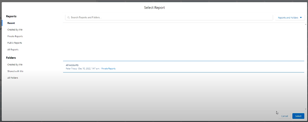
I can click on Edit (top right corner):

I can add a Component:

I select my report (All Accounts), then click Select:
Then I can use the Display to show how I want to be displayed:

Now, I have the option on the Y-Axis to display; in this case, I select Industry.
On the X-Axis, either have the Sum of Amount (which is what I'm interested in), or I can have the Record Count. If I choose the Record Count, I'll have the same values, but displayed differently than my donut display (what I have on my left-hand side).
I'm curious about the Sum of Amount and I can then change the how it's sorted. I want to be Sort By the Sum of Amount and in decreasing order (down arrow):

Now I know that the Energy sector is where I made most of my sales.

I can set the number of groups, Max Groups Displayed, so maybe I want to have the top five. If I do that, I'll have my top five industries.

I can have a Title that I can update (Top 5 Industries), and I click on Add.

Now I can drag and drop into my dashboard, and Save my dashboard.

I can see that
I have 33 opportunities in my environment,
Broken down by industries where I have my deals and
Further broken down by my top five industries.
In details, I can see that Energy has 10 opportunities and generated most of my sales, followed by Hospitality.

Then you can see, even though I have four deals in Electronics, Electronics is not in my top five revenues. The opposite is Transportation, which is in the widget, while only having three deals.
This is how we can format a chart in a Dashboard.
You've made it!
If you liked these posts, please click like and subscribe.
Thank you.
Watch the video below.
Comments